
<!doctype html>
<html lang="en">
<head>
<meta charset="utf-8" />
<meta name="viewport" content="width=device-width,initial-scale=1" />
<title>Micro DataSoft — E‑Commerce Solutions</title>
<meta name="description" content="Custom, secure and scalable e-commerce platforms by Micro DataSoft. Request a demo today." />
<!-- Tailwind CDN for quick prototyping -->
<script src="https://cdn.tailwindcss.com"></script>
<style>
/* Small custom styles for hero overlay and cards */
.hero-bg{background-image: url('assets/hero.jpg'); background-size: cover; background-position: center;}
.glass{background: rgba(255,255,255,0.03); backdrop-filter: blur(6px);}
.feature-icon{width:48px;height:48px;border-radius:8px;background:linear-gradient(135deg,#0ea5a4, #16a0ff);display:flex;align-items:center;justify-content:center;color:white}
</style>
</head>
<body class="antialiased text-slate-800 bg-slate-50">
<!-- Top bar -->
<div class="bg-slate-900 text-slate-100 text-sm">
<div class="max-w-7xl mx-auto px-4 py-2 flex justify-between items-center">
<div class="flex items-center gap-4"><span class="hidden sm:inline">info@microdatasoft.com</span><span>+8801790551661</span></div>
<div class="flex items-center gap-3">
<a class="hover:underline" href="#">Facebook</a>
<a class="hover:underline" href="#">LinkedIn</a>
</div>
</div>
</div>
<!-- Navigation -->
<header class="bg-white shadow">
<div class="max-w-7xl mx-auto px-4 py-4 flex items-center justify-between">
<a href="#" class="flex items-center gap-3">
<div class="w-10 h-10 bg-gradient-to-br from-yellow-300 to-red-400 rounded"></div>
<span class="font-semibold text-lg">Micro DataSoft</span>
</a>
<nav class="hidden md:flex gap-6 items-center">
<a href="#" class="text-slate-700">Home</a>
<a href="#features" class="text-slate-700">Features</a>
<a href="#pricing" class="text-slate-700">Pricing</a>
<a href="#contact" class="text-slate-700">Contact</a>
<a href="#" class="px-4 py-2 rounded bg-blue-500 text-white">Request Demo</a>
</nav>
<button id="mobileBtn" class="md:hidden px-3 py-2 bg-slate-100 rounded">Menu</button>
</div>
</header>
<!-- Hero -->
<section class="hero-bg relative text-white">
<div class="absolute inset-0 bg-black/50"></div>
<div class="max-w-7xl mx-auto px-4 py-24 relative z-10">
<div class="max-w-3xl">
<h1 class="text-4xl md:text-5xl font-bold">E‑Commerce Platforms That Sell — Fast</h1>
<p class="mt-4 text-lg text-slate-200">Custom, secure, and scalable online stores tailored for retail, marketplaces, and m‑commerce.</p>
<div class="mt-6 flex gap-4">
<a href="#contact" class="px-6 py-3 rounded bg-blue-500 hover:bg-blue-600">Request a Demo</a>
<a href="#pricing" class="px-6 py-3 rounded border border-slate-300 text-white/90 bg-white/6">See Pricing</a>
</div>
<div class="mt-6 flex gap-4 text-sm text-slate-200">
<span class="p-2 bg-white/6 rounded">SSL & PCI‑Compliant</span>
<span class="p-2 bg-white/6 rounded">24/7 Support</span>
<span class="p-2 bg-white/6 rounded">AWS / GCP</span>
</div>
</div>
</div>
</section>
<!-- Quick value strip -->
<section class="max-w-7xl mx-auto px-4 py-10">
<div class="grid grid-cols-1 md:grid-cols-4 gap-6 text-center">
<div class="p-6 bg-white rounded shadow-sm">
<div class="feature-icon mx-auto mb-3">⚡</div>
<h4 class="font-semibold">Fast to Market</h4>
<p class="text-sm text-slate-500 mt-2">Launch in weeks, not months.</p>
</div>
<div class="p-6 bg-white rounded shadow-sm">
<div class="feature-icon mx-auto mb-3">🔒</div>
<h4 class="font-semibold">Secure Payments</h4>
<p class="text-sm text-slate-500 mt-2">PCI‑compliant gateway integrations.</p>
</div>
<div class="p-6 bg-white rounded shadow-sm">
<div class="feature-icon mx-auto mb-3">📱</div>
<h4 class="font-semibold">Mobile First</h4>
<p class="text-sm text-slate-500 mt-2">Optimized checkout for all screens.</p>
</div>
<div class="p-6 bg-white rounded shadow-sm">
<div class="feature-icon mx-auto mb-3">⚙️</div>
<h4 class="font-semibold">Scalable</h4>
<p class="text-sm text-slate-500 mt-2">Handles growing traffic & SKUs.</p>
</div>
</div>
</section>
<!-- Product overview -->
<section class="max-w-7xl mx-auto px-4 py-12">
<div class="grid md:grid-cols-2 gap-8 items-center">
<div>
<h2 class="text-2xl font-semibold">Everything your online store needs</h2>
<p class="mt-4 text-slate-600">Our e‑commerce solution combines an intuitive storefront with a powerful admin dashboard. From product variants to payment reconciliation and automated shipping rules — we build systems that reduce manual work and improve conversions.</p>
<ul class="mt-4 list-disc pl-5 text-slate-600">
<li>Custom storefront & branding</li>
<li>Fast, secure checkouts</li>
<li>Flexible shipping & tax rules</li>
</ul>
<a href="#features" class="inline-block mt-6 px-5 py-3 bg-blue-500 text-white rounded">View Features</a>
</div>
<div class="bg-white rounded shadow p-4">
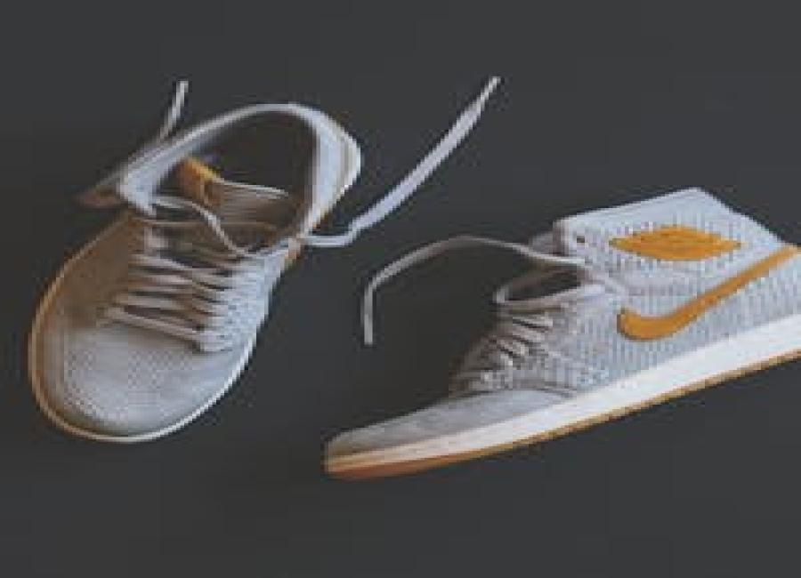
<img src="assets/mockup.png" alt="product mockup" class="w-full h-64 object-cover rounded" />
</div>
</div>
</section>
<!-- Features grid -->
<section id="features" class="bg-slate-50 py-12">
<div class="max-w-7xl mx-auto px-4">
<h3 class="text-xl font-semibold">Core Features</h3>
<div class="grid md:grid-cols-3 gap-6 mt-6">
<div class="p-6 bg-white rounded shadow">
<h4 class="font-semibold">Product & Catalog Management</h4>
<p class="mt-2 text-sm text-slate-500">Bulk import, variants, SKUs and powerful categorization tools.</p>
</div>
<div class="p-6 bg-white rounded shadow">
<h4 class="font-semibold">Checkout & Payments</h4>
<p class="mt-2 text-sm text-slate-500">Multi-gateway integrations, saved cards, secure tokenization.</p>
</div>
<div class="p-6 bg-white rounded shadow">
<h4 class="font-semibold">Orders & Shipping</h4>
<p class="mt-2 text-sm text-slate-500">Automated fulfillment, courier integrations & tracking.</p>
</div>
<div class="p-6 bg-white rounded shadow">
<h4 class="font-semibold">Admin & Inventory</h4>
<p class="mt-2 text-sm text-slate-500">Role-based access, stock alerts and reporting tools.</p>
</div>
<div class="p-6 bg-white rounded shadow">
<h4 class="font-semibold">Marketing & Promotions</h4>
<p class="mt-2 text-sm text-slate-500">SEO tools, coupon rules and email campaign hooks.</p>
</div>
<div class="p-6 bg-white rounded shadow">
<h4 class="font-semibold">Analytics & Reports</h4>
<p class="mt-2 text-sm text-slate-500">Sales dashboards, customer segments and A/B insights.</p>
</div>
</div>
</div>
</section>
<!-- Pricing -->
<section id="pricing" class="max-w-7xl mx-auto px-4 py-12">
<h3 class="text-xl font-semibold">Pricing & Packages</h3>
<div class="grid md:grid-cols-3 gap-6 mt-6">
<div class="p-6 border rounded bg-white shadow-sm">
<h4 class="text-lg font-semibold">Starter</h4>
<p class="mt-2 text-slate-500">Perfect for small stores.</p>
<div class="mt-4 text-3xl font-bold">From $499</div>
<ul class="mt-4 text-sm text-slate-600 list-disc pl-5">
<li>Up to 500 SKUs</li>
<li>Basic payments</li>
<li>Email support</li>
</ul>
<a href="#contact" class="mt-6 inline-block px-4 py-2 bg-blue-500 text-white rounded">Start Free Trial</a>
</div>
<div class="p-6 border-2 border-blue-100 rounded bg-white shadow-sm">
<h4 class="text-lg font-semibold">Business</h4>
<p class="mt-2 text-slate-500">For growing brands.</p>
<div class="mt-4 text-3xl font-bold">Custom</div>
<ul class="mt-4 text-sm text-slate-600 list-disc pl-5">
<li>Up to 5,000 SKUs</li>
<li>Multi-currency & marketplace</li>
<li>Priority support</li>
</ul>
<a href="#contact" class="mt-6 inline-block px-4 py-2 bg-blue-500 text-white rounded">Request Quote</a>
</div>
<div class="p-6 border rounded bg-white shadow-sm">
<h4 class="text-lg font-semibold">Enterprise</h4>
<p class="mt-2 text-slate-500">Full custom solutions.</p>
<div class="mt-4 text-3xl font-bold">Custom</div>
<ul class="mt-4 text-sm text-slate-600 list-disc pl-5">
<li>Dedicated infra</li>
<li>SSO & SLAs</li>
<li>Onboarding & training</li>
</ul>
<a href="#contact" class="mt-6 inline-block px-4 py-2 bg-blue-500 text-white rounded">Talk to Sales</a>
</div>
</div>
</section>
<!-- How it works -->
<section class="bg-slate-50 py-12">
<div class="max-w-7xl mx-auto px-4">
<h3 class="text-xl font-semibold">How it works</h3>
<div class="grid md:grid-cols-3 gap-6 mt-6 text-center">
<div class="p-6 bg-white rounded shadow"> <div class="text-3xl">1</div><h4 class="mt-2 font-semibold">Plan</h4><p class="text-sm text-slate-500 mt-2">Discovery, UI/UX and timeline.</p></div>
<div class="p-6 bg-white rounded shadow"> <div class="text-3xl">2</div><h4 class="mt-2 font-semibold">Build</h4><p class="text-sm text-slate-500 mt-2">Agile sprints, QA and staging review.</p></div>
<div class="p-6 bg-white rounded shadow"> <div class="text-3xl">3</div><h4 class="mt-2 font-semibold">Grow</h4><p class="text-sm text-slate-500 mt-2">Launch, monitor and optimize.</p></div>
</div>
</div>
</section>
<!-- CTA / Contact -->
<section id="contact" class="max-w-7xl mx-auto px-4 py-12">
<div class="grid md:grid-cols-2 gap-8 items-center bg-white rounded shadow p-6">
<div>
<h3 class="text-2xl font-semibold">Ready to grow online?</h3>
<p class="mt-3 text-slate-600">Book a free demo and get a tailored roadmap for your store.</p>
</div>
<form class="space-y-4">
<input class="w-full border p-3 rounded" placeholder="Full name" />
<input class="w-full border p-3 rounded" placeholder="Business email" />
<select class="w-full border p-3 rounded">
<option>Interested in: Starter</option>
<option>Business</option>
<option>Enterprise</option>
</select>
<div class="flex gap-3">
<button type="submit" class="px-5 py-3 bg-blue-500 text-white rounded">Request Demo</button>
<a href="#" class="px-5 py-3 border rounded">Contact Sales</a>
</div>
</form>
</div>
</section>
<!-- Footer -->
<footer class="bg-slate-900 text-slate-200 py-8">
<div class="max-w-7xl mx-auto px-4 grid md:grid-cols-3 gap-6">
<div>
<h4 class="font-semibold">Micro DataSoft</h4>
<p class="text-sm text-slate-400 mt-2">H#07, R#12, B#C, S#12, Pallabi, Mirpur, Dhaka</p>
</div>
<div>
<h4 class="font-semibold">Products</h4>
<ul class="text-sm text-slate-400 mt-2 space-y-1"><li>Retail Cloud</li><li>Custom Dev</li></ul>
</div>
<div>
<h4 class="font-semibold">Contact</h4>
<p class="text-sm text-slate-400 mt-2">info@microdatasoft.com<br/>+8801790551661</p>
</div>
</div>
</footer>
<script>
// Simple mobile menu toggle
document.getElementById('mobileBtn').addEventListener('click', function(){
const nav = document.querySelector('header nav');
if(nav.classList.contains('hidden')) nav.classList.remove('hidden'); else nav.classList.add('hidden');
});
</script>
</body>
</html>